We as continuous improvement practitioners spend a tremendous amount of time learning how to analyze data and comparatively little time learning how to communicate it. That seems backwards when you think about it. The harder, messier work of improvement involves communicating the findings of your analysis, why the improvements you’ve selected are worthwhile, and rallying the people involved to sustain a changed way of working. In other words, the more important part is not the stats analyses themselves, but the decisions they ignite. Shouldn’t our focus, then, be balanced similarly?
Data visualization is often an overlooked skill, even though plotting the data can reveal patterns and variation that summary statistics alone may conceal. It’s not analytical, per se, but more of a translation skill. It’s the ability to synthesize information the data provides with information people provide and unpack that in a way that is digestible and confident for everyone else. A good visualization doesn't simply display data. It helps someone who hasn't lived inside your improvement project for weeks understand what changed, why it matters, and what they should do next.
Presentation designers often describe slides as "glance media" rather than reading media. One commonly cited rule of thumb is the three-second rule: can someone understand the main message of your slide in about three seconds? If not, the slide is probably asking your audience to do too much work. Stakeholders shouldn't have to study a chart to discover its conclusion. The conclusion should be immediately apparent, with the details available for anyone who wants to dig deeper.
That's easier said than done. It’s challenging to decide how much context your audience actually needs. Too much, and the important story gets buried beneath details that mattered during the analysis but not during the presentation. Too little, and at best you will confuse your audience and at worst you risk misleading them altogether. Like the childhood story, Goldilocks, you're looking for the serving that's just right, the one that makes the right conclusion unavoidable.
To see what that looks like in practice, let's take a single trend chart from a cycle time reduction project and serve it three different ways:
The All-You-Can-Eat Buffet
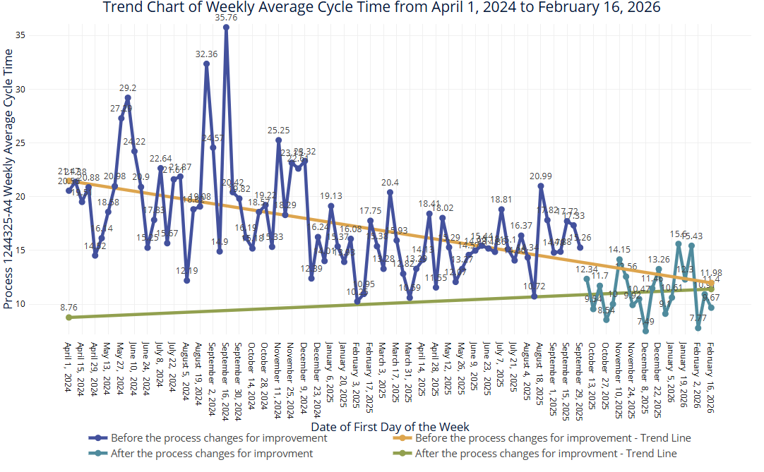
The first common pitfall occurs when a practitioner overstuffs their plate, showing every detail captured in their analysis, an understandable temptation after spending weeks digging through process data. The problem with that approach is it floods the person on the receiving end with an unstructured dump of details that bury the main message.
In this scenario, the process cycle time successfully dropped from an average of 15 minutes down to 11 minutes. Was that obvious in 3 seconds? Assuming the answer is no, let’s break down why:
- The graph includes a large amount of historical data at the start before a clear period of stability before the change took place, which could leave people to believe the true improvement is an exaggeration of past changes.
- Two separate linear regression lines are plotted across each stage, incorrectly forecasting a continuous upward or downward trend instead of showing a shift in the process that is randomly varying about an average.
- The plot, legend, and axis titles are overwhelmingly long and wordy, making it difficult to digest efficiently.
- The labels for the dates on the x-axis are fully spelled out for each day in a long format, creating a dense, cluttered wall of non-value added text.
Each aspect of this plot can be appropriate for specific applications, but when visualizing data to tell the story of a clear cycle time improvement from a steady state of 15 minutes to a new improved steady state of 11 minutes, this plot is the graph equivalent of an all you can eat buffet: overwhelming, chaotic, and guaranteed to induce a cognitive food coma.
The Appetizer with No Main Course
On the other end of the spectrum is the “leave you wanting more”. This approach is minimalist, sparse, and leaves stakeholders hungry for actual insights. In an effort to look executive ready, they adopt an ultra minimalist style.
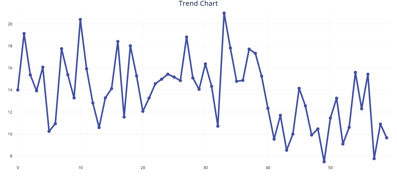
In this version, the presenter cuts down the data to the appropriate timeframe but strips away every single helpful landmark on the trend plot:
- The chart features no plot title, no x-axis title, and no y-axis title, leaving the parameters completely undefined.
- There are no time stamps or dates displayed on the x-axis, meaning the audience has no idea when the data was collected or how long the tracking period lasted.
- The data points are shown as a single, continuous line with zero visual separation or staging between the before and after states. This leaves the time when the process change was implemented up to interpretation instead of clearly defined.
- Essential summary statistics are entirely omitted from the visual, giving the viewer no baseline or improvement metrics to hold onto.
It looks incredibly sleek, but at the expense of actual proof points.
The Balanced Portion
To tell a perfect data story, we must serve a well balanced visual meal where the chart layout instantly communicates the operational shift. Below is the same data we’ve now covered in the last two examples, except this time the trend chart is curated to show exactly what matters to the decision makers.
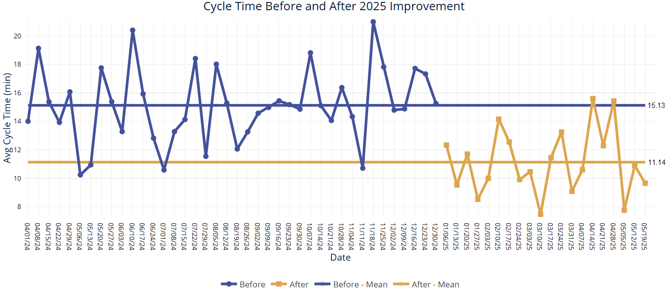
We use the correct, scoped data range representing the stable baseline and the improved state. The layout elements are optimized to guide the eye directly to the project success:
- The plot title and axis titles are short and punchy, giving immediate context to the viewer.
- The dates on the x axis are cleaned up into an efficient, easy to read format that eliminates visual noise.
- The chart features distinct average lines for the two means of each stage, allowing the timeline to cleanly step down from 15.13 minutes to 11.14 minutes.
- The visual instantly demonstrates both the magnitude and the stability of the operational shift at a single glance.
The perfectly balanced portion provides someone with a 3-second understanding of the story the data is telling.
The Complete Recipe
A well done data visualization isn’t the one with the most detail or the cleanest presentation; it’s the one that leads to the right decisions. It’s easy to fall into these traps of dumping too much in or pulling too much out, especially after analyzing the data for hours and trying to jam your presentation into a few slides. But a visual that is “just right” is one that translates the story that the data is trying to tell and leads to the correct decisions being made.
That's one of the reasons we've invested so heavily in visualization throughout EngineRoom. The software doesn't treat statistical analysis and visualization as separate activities. It brings them together, helping practitioners build charts that communicate clearly while remaining grounded in rigorous analysis.
So, the next time you're preparing a presentation, ask yourself whether someone seeing it for the first time could explain the main takeaway in about three seconds. If they can, you've probably struck the right balance. If they can't, the problem may not be your analysis. It may simply be the way you've chosen to tell the story.